Ecommerce Brand Refresh + Design System
As manager of Eargo’s UX Product Design team, I led the brand refresh initiative by converging on a design system that drew inspiration from three key Ecommerce pages designed by my team.
Eargo 6 Product Detail Page (PDP)
-
Managed responsibilities & guided designers for timely work. Utilized design thinking for cross-functional alignment & storytelling. Translated business strategy into ideas.
-
Conducted explorations and designed responsive UX/UI for panels from multiple iterations. Created animations for vertical scroll. Visualized ideas via sketches & storyboards. Collaborated with creative team on media & copywriting.
The Eargo Difference
-
Staffed project, gave timely feedback for creative solutions. Prioritized content with wireframes. Explored trends for best practices. Translated brand refresh into UI patterns.
-
Crafted impactful visuals for users. Sourced & optimized marketing imagery for responsive web. Explored content overflow UI patterns.
Eargo Brand
-
Defined content architecture. Integrated marketing strategies & target audience. Conceptualized & executed new visual identity.
-
Explored and animated designs in line with scrolly-telling best practices. Ensured visuals were tailored to evoke emotions, enhance user engagement, and prioritized the user's perspective.

-
Inter Surpassed Akzidenz-Grotesk Lite Limits
We switched from Akzidenz-Grotesk to Inter, a free Google font with more variables, eliminating the need for a foundry license. While Inter lacks a spur on 'G', it's similar to Akzidenz-Grotesk, saving costs and easing licensing burdens for our legal team.
-
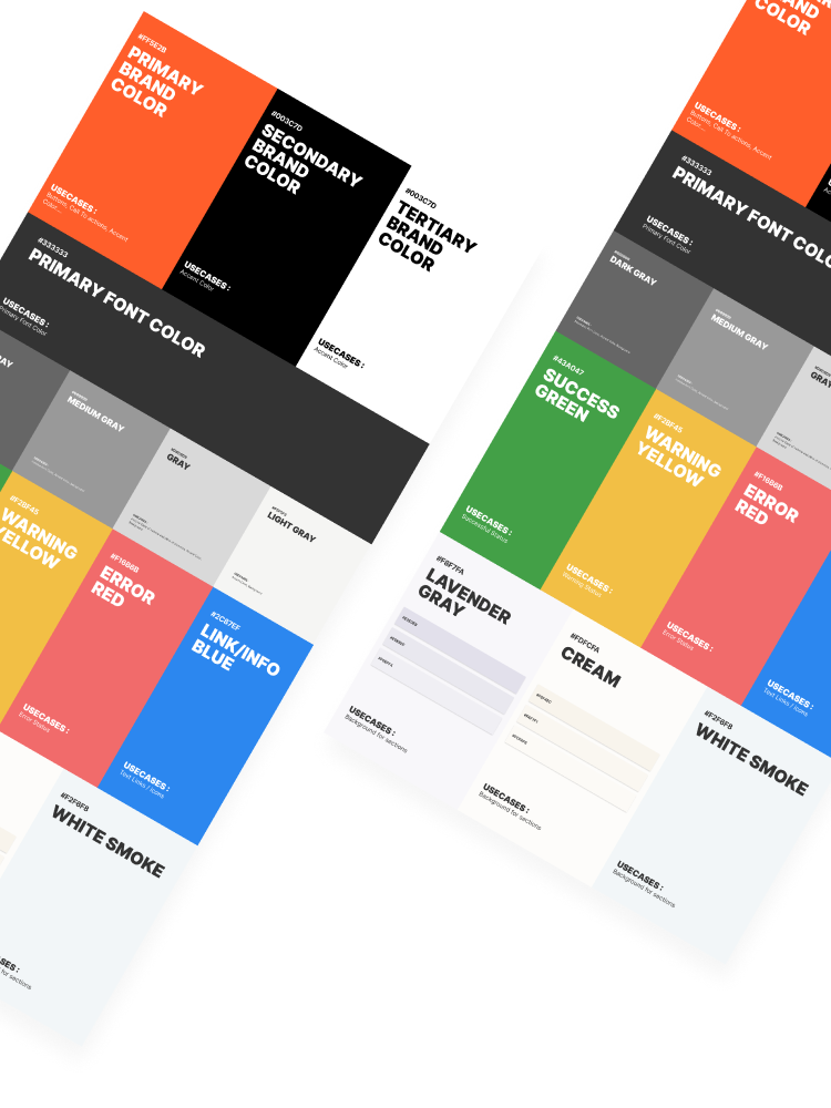
Simplified Brand Palette: Light & Easy
Eargo previously overused its primary orange, leading to distractions. We introduced a simpler color palette emphasizing product lightness and user experience. While retaining Eargo orange as an accent, we shifted to a predominantly black and white brand-scape, ensuring a balanced visual identity.
-
Eargo's Brand Makeover: A Total Rollout
I crafted the company's visual brand guidelines, establishing a unified foundation for creative teams. This ensures that all marketing materials consistently reflect the brand's messaging and values.
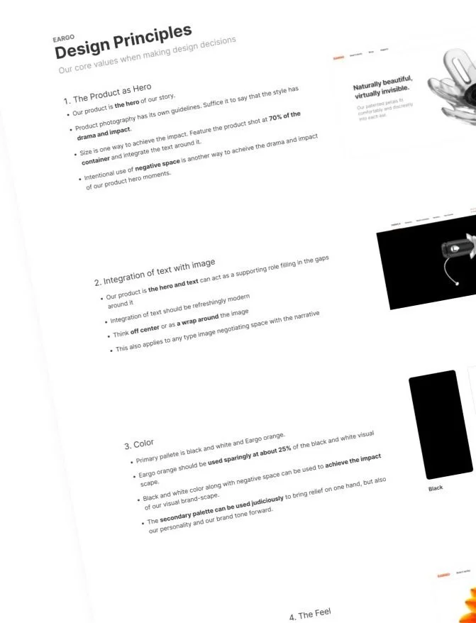
Our design principles kept us focused and on track
Research & evidence
Follow the UCD process
The design was tailored towards specific user persona types and key moments in the purchase funnel. I utilized evidence-based approaches and synthesized findings to create scaffolding and page goals as input for my team.


Speed and flexibility
Designing with modularity
By using low-fidelity artifacts, we were able to focus on the core elements of the narrative without getting bogged down in details. This enabled us to explore multiple design options and make changes as needed based on feedback.

Breaking things down
Storyboarding assets for digital scrolling
My team excelled in problem-solving and supporting our marketing partners. The video agency required guidance on scroll-video interaction. Our UX Design team storyboarded the Eargo 6 video aligned with the page scroll.
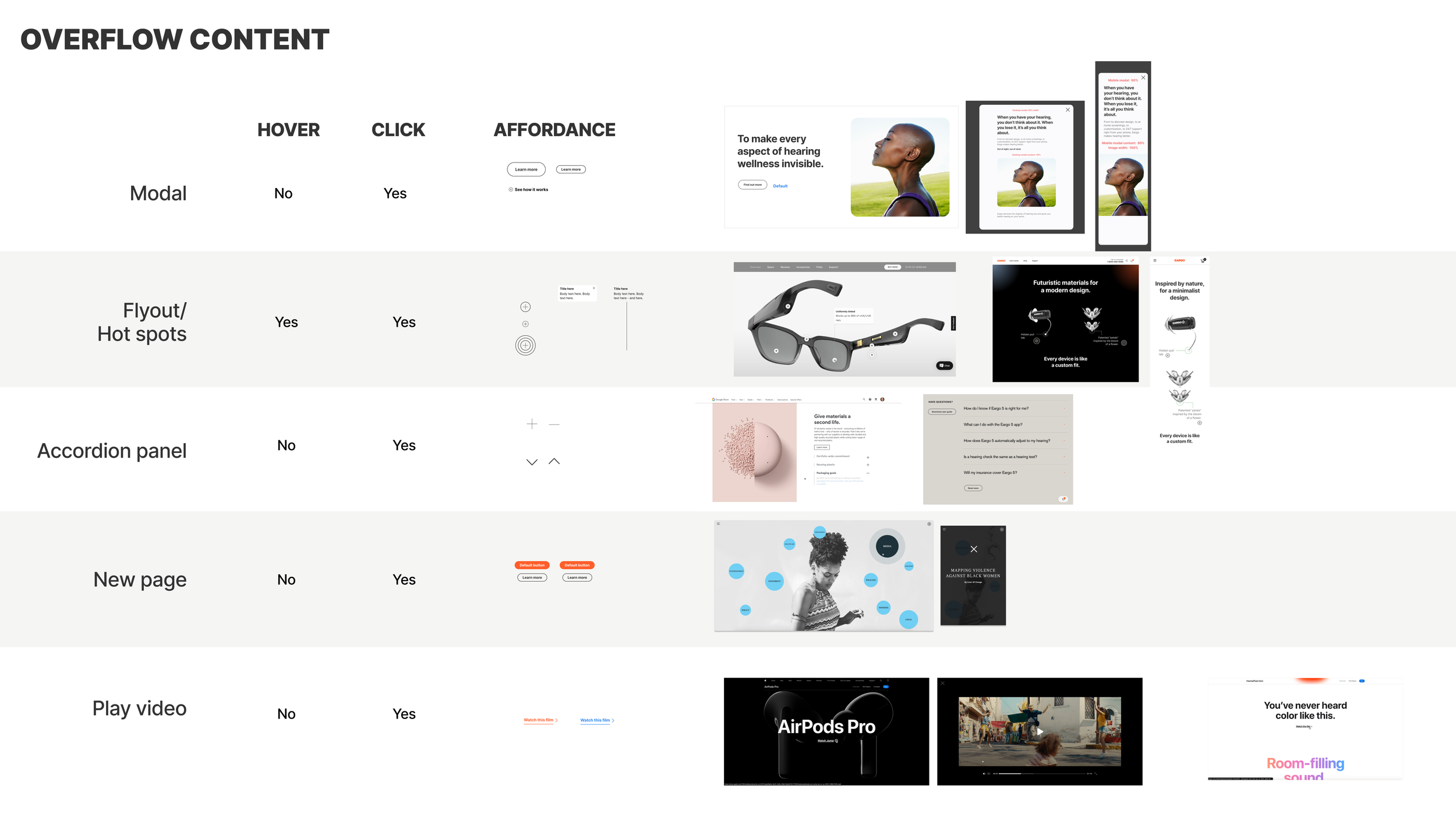
Constantly exploring the UI
Example UI exploration for content overflow
Marketing pages are content-rich, but audiences have limited attention. Using progressive disclosure in UX, we explored designs balancing viewer interest with the long page scrolly-telling format.
We evolved the brand guidelines through iterative design as we launched these three Ecommerce pages. I documented decisions and usage notes into Eargo's new visual guidelines. I synthesized the brand refresh so we could integrate the interaction patterns into our design library as a team.
Trusting the design process enhanced clarity and momentum
Video screen capture of the Eargo 6 PDP Figma prototype
Design highlights from The Eargo Difference and Brand pages
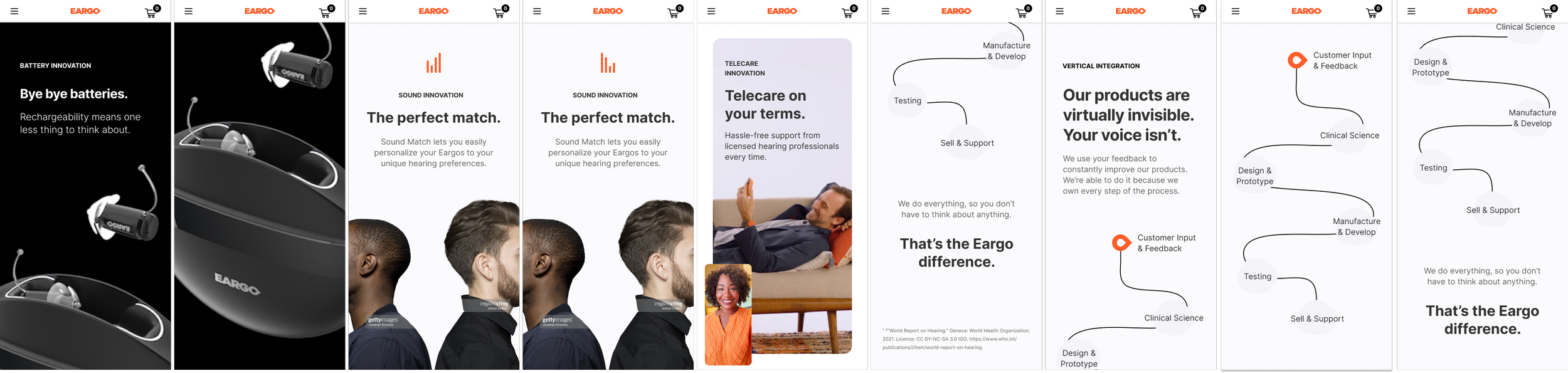
The vast impact of global hearing loss is depicted through bold typography and black and white drawings. Our new illustrations promote inclusiveness with extended line curves. The updated imagery portrays individuals with hearing loss as confident and thriving, countering typical stigmas.


The advantage of a rechargeable device is highlighted with the product taking center stage, occupying over 50% of the page. Strategic use of negative space amplifies the product's dramatic presence.


Eargo Orange is used minimally, complemented by a secondary palette and new lifestyle imagery to enhance our brand tone. The fresh illustrative style, featuring airy line drawings, playfully yet maturely depicts Eargo's production process.

The brand marketing one-pager
I collaborated organization-wide to adapt the new brand one-pager into designs for other marketing platforms, including landing pages, social media, emails, and the company blog.
